Case STudy
bauvision.
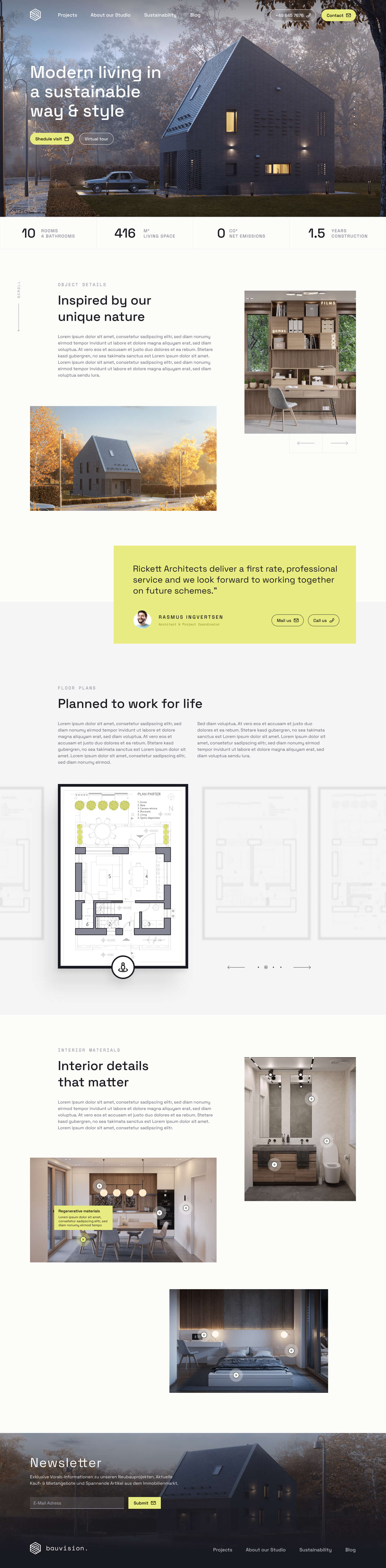
New Branding & Website concept for a new real estate developer. Vibrant, modern, disruptive. Here to stay!
About this project
The new branding and website concept for the real estate developer promises to be vibrant, modern, and disruptive. bauvision is here to stay, and their branding reflects their long-term commitment to change an entire industry. With a fresh, innovative approach, the company aims to stand out in a traditional market and make a lasting impact. Bauvision provides potential customers with easy access to essential information about the company and their willingness to embrace change and innovation.
Lukas Sautter
UX/UI Strategist based in Munich, Germany
Currently working for Bosch Siemens HA
Project Type
Branding & Concept
Web Development

Font Family
Space Grotesk
A modern but techie vibe, just right to streamline between traditional real estate development and architectural modernism. The hard edges and serifs represent a brutalist new approach to a traditional industry.
Color & Brand
Color Palette
A vibrant lime as the primary and highlight color serves as eyecatching element within the brand. It’s artifical root complements the secondary colors that all have natural earth tones. The same combination as bauvision uses in it’s real estate projects. Natural and sustainable materials combined with modern and artificial textures.


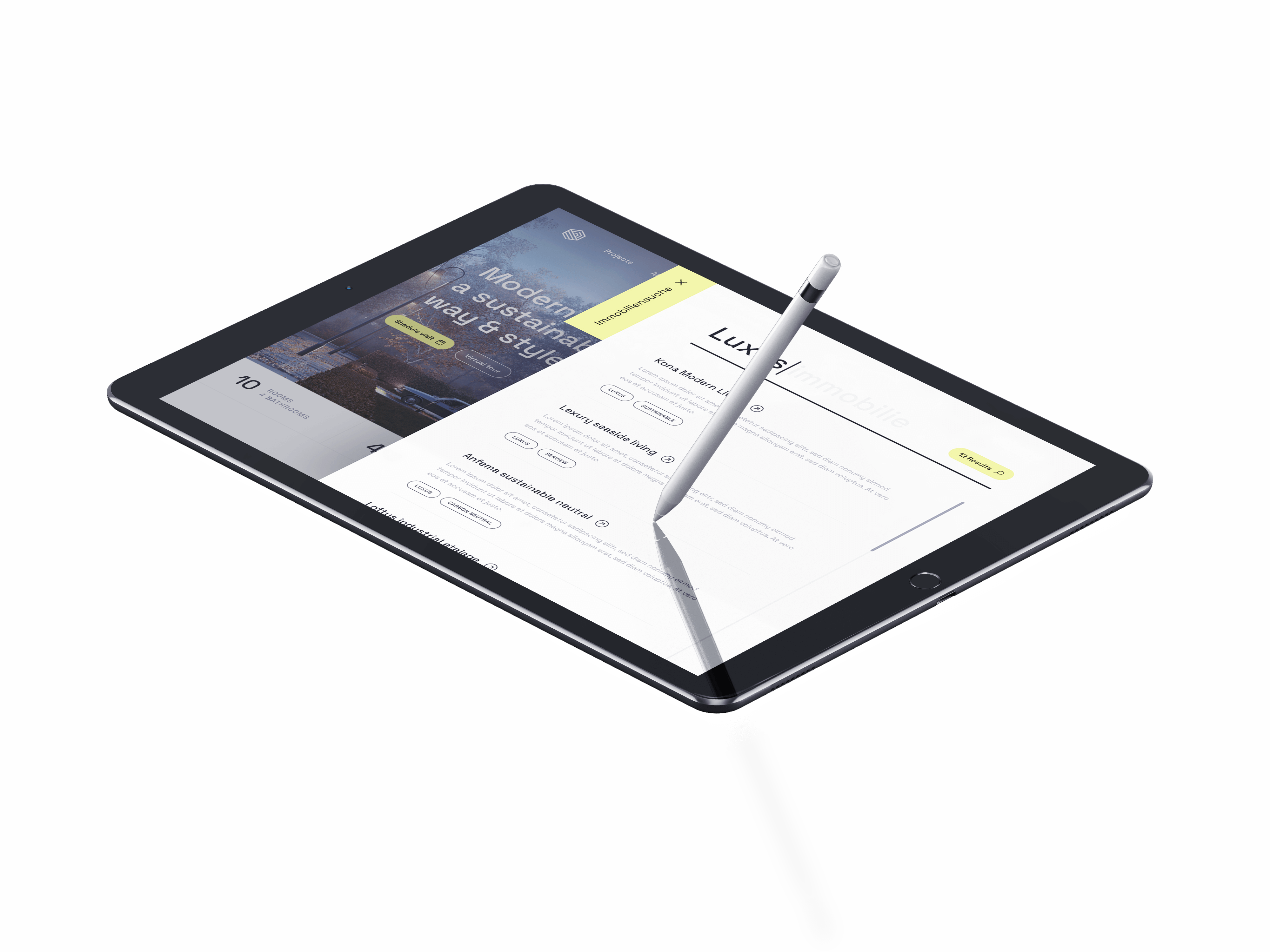
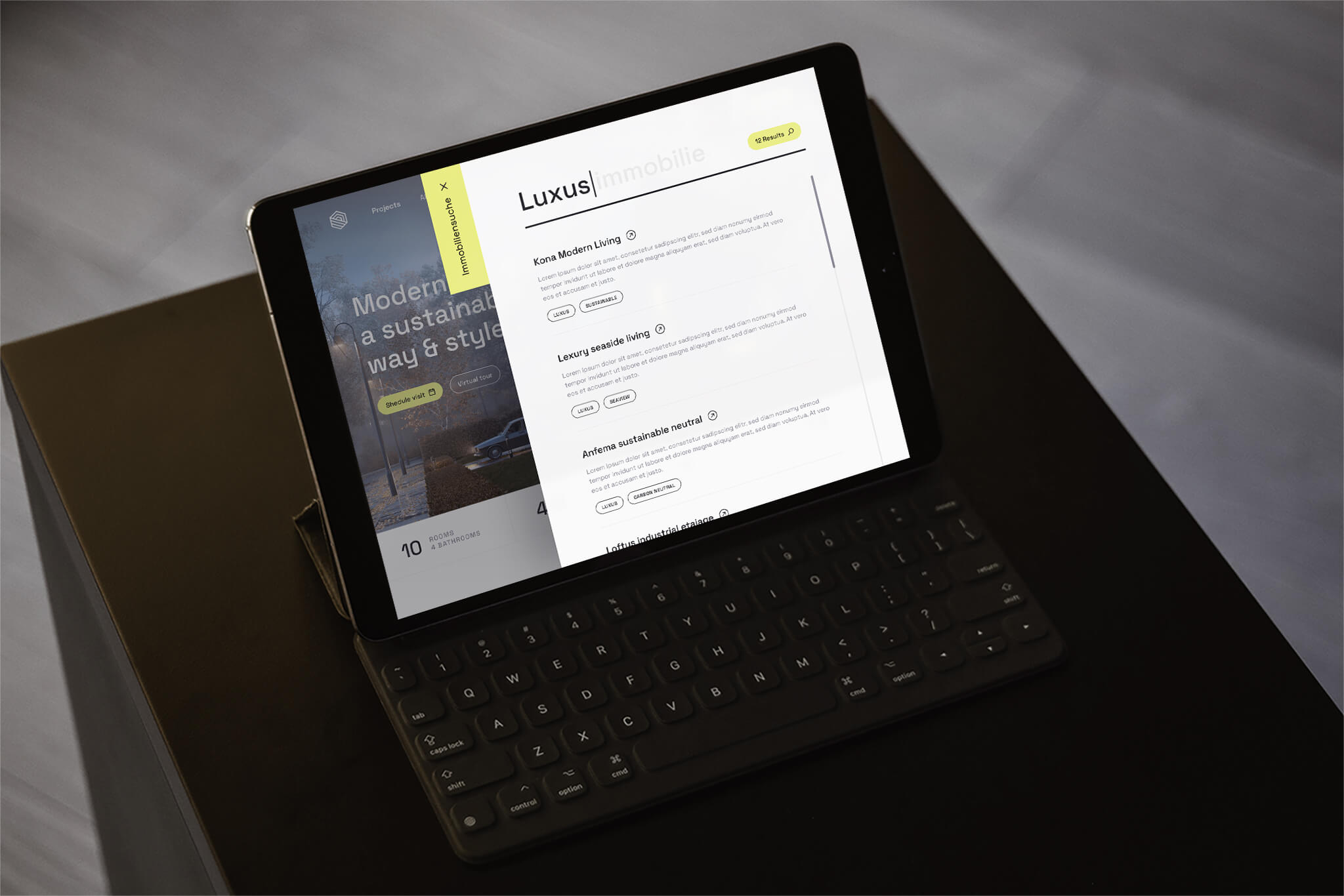
Website
Bauvision Homepage